My project that I have been working on for these past months has been a music magazine based around the 'Indie/Alternative Genre. It is called 'Indie-Pendant' and is focused the same type of genre as NME, that is a popular magazine on the market. I decided to choose this option because I felt i could work better on my own than in a group. After i had finished my music magazine, i created an audience feedback questionnaire which is below. My audience feedback asked questions on my music magazine to see if it fit the right genre/target audience i was trying to hit. I asked ten people to fill in my questionnaires.
Audience Feedback:
1- What does the name of the magazine suggest to you?
Nearly all of the feedback i got suggested that my title 'Indie-Pendance' realated to indie music or alternative music. They said that you can tell this because the indie genre is called independance music. This feedback was definatley good as my title gave off the right connatations of my magazine. My particiapants also said that the title suggests the magazine is going to be about the current British music scene and all of the sub-genres in it.
2- What genre/type of music do you think the music magazine focuses on and how do you know this?
Every one of my participants knew that my magazine focused on Indie/Alternative and none of them thought it belonged to another drama. The participants said they knew this from the use of colour, costumes of my protagonists and also the fonts i have used.
3- Do you think the pages are professional? If so, why?
All my participants said they thought all of my pages look professional, some of them said it was the titles and fonts used on my pages which made it professional. Alot of them said it was the images that i had used on my Front page, Contents and Feature Article to make it look professional and also two people said it was the layout of the pages which made them look professional.
4- On the feature article, did the interview interest you, If so why?
All of them said that my interview was very interesting and easy to read. Most of them said they were interested by it by the way in which the band were talking as it seemed very friendly/relaxed. Also three participants said it was 'Indie-pendants' style of questions that helped to keep it informal and attracted them to reading on.
5- How do you feel about the contents page? Do you think it looks genuine/professional?
8/10 people said that they think my contents page looks genuine and they feel it is neat and easy to read. The other two participants said they think it could look more genuine if there wasnt as many boxes for the pages and if they were in a bigger font.
6- Do you like the Article Layout, If so which bits?
All of my participants stated that they likes my layout, 5 of them said they liked how the writting is sectioned into red text boxes. 3 of them said they like how the pictures are put round the interview so it doesn't look boring when you glance at it. Also 1 said they liked how the pictures/text and title were placed on the double page spread.
7- Do my pictures fit in with the genre of my magazine, If so why?
All of my participants said that my pictures reflect the 'indie' genre which is what my music magazine is. They said you can tell this by the way in which the band are posing and the clothes in what they are wearing. Also that one the live photos they have guitars.
8- Could i improve my magazine, if yes that what could i change?
6 participants though that i didn't need to change anything on my music magazine and it was perfect how it was. 2 people said I could of used better pictures on my feature article. Also two people said i could of filed up more space on my front cover.
Questions
Q1- In what way does your media product use, develop and challenge forms and conventions of real media products?
Before producing my product, I researched into different music magazines that are on the market to buy. I looked into the genre of Indie/Alternative music and the magazine that I think matches the magazine I want to create the most was the magazine Nme.

This is one of the covers that stood out to me when looking at possible NME covers. To me this reflects the genre 'indie/alternative' as it is a famous lead singer Ian Curtis which will definatley attract young fans of his music as he is very iconic in this genre. When planning my music magazine, I got inspiration from the colours used on this front cover. They are very basic but I feel are very effective, they are alot the 'typical' colours used in this genre.This cover also inspires me by the layout of it, I like how each of the headings are in different font/sizes so that each of them stands out. I tried to resemble this in my own magazine cover because I think it works very well when people glance at your cover.
In order to assure any real media product, conventions of that genre have to be followed in order to be sucsessful. I definatley think that my music magazine follows certain conventions of the Indie genre on the music scene. I think this becuse all of my colours/photos/text was carefully thought about and researched into, looking at similar indie music magazines on the market such as NME. The first convection i followed was finding out my target audience which i decided was 16-20 year olds and then designing my magazine on it appealing to them. Another convention i have followed is i researched into what colours are mainly used in the 'indie' music magazines, the main colours i got were red,black and white so these are the three dominate colours that i used. I followed the convections of my genre all the way through my magazine and not just on my contents page. Too make my magazine look more professional, i have added a barcode to the front page so that my magazine looks like one you would find on the shelves. The key things i have thought about whilst producing my music magazine are as follows:
Colours that reflect my chosen genre
Professional and clear images that protray my genre and artists
Fonts that reflect my chosen genre
An article that will draw people in
Clear and consistant pages that all blend well together
When creating a particular magazine with a specific genre and target audience i feel these things are very important. Even though i am following all of the conventions of my genre to make my magazine a sucsess I think it is important to not copy straight from 'Indie' magazines because then your music magazine doesnt have a unique selling point and your target audience will not be interested in it.
Conventions on Front Cover
My front cover i feel has turned out very well in terms of following conventions of my music magazine. I researched into different magazines that were similar to my genre and looked at the way in which the front cover shot was taken and displayed. I think that my photo definatley potrays the band exactly how i wanted it to and also reflects the genre of my magazine perfectly. The shot of my photo is good and the clothes that my protagonists are wearing shows the 'indie' theme.
My front cover i feel has turned out very well in terms of following conventions of my music magazine. I researched into different magazines that were similar to my genre and looked at the way in which the front cover shot was taken and displayed. I think that my photo definatley potrays the band exactly how i wanted it to and also reflects the genre of my magazine perfectly. The shot of my photo is good and the clothes that my protagonists are wearing shows the 'indie' theme.

This is the font i finally decided to use for the name of my magazine. I think i made the right choice as the text boxes highlight the rough edge and differntnes of my magazine because all of the letters are different sizes and in different size boxes which reflects the music that is featured in my magazine. I have left the title plan black and white as i think it stands out and they are both typical colours of my genre of music.
Another way in which i have followed the conventions of my genre on my first colour is having featured bands at the bottom of the page which i have seen in other 'indie' magazines that are available. My front cover features three main colours which are Red, black and white, I have chosen to use these three colours because after researching into an appropriate colour scheme, these are the three colours that i found most popular in reflecting my genre.
Conventions of Contents Page:
I have followed the same conventions from my front cover onto my contents page inside my magazine.
-The first convention that i have used is the title, I have used the same font as on my front cover to give off the same conotations to my target audience.
-One thing i have challanged the media on in my contents page is the fact that my background is black. After researched I have found that most contents pages are white but in order to add abit of individuality to my magazine, I decided that my contents page would be black.
-The second thing i have done to follow the conventions is i have added an imagine of the lead singer of my feature band, playing live with a guitar in his hand, this is a typically image that is featured on contents pages as it shows the rock and roll image of the magazgine by the use of a guitar being used.
-The use of colour is another convention i have followed onto my contents page. I have used the use of black white and red again, using red text boxes to highlight the pages of my magazine like such magazines as NME do.
- Another way in which i have challanged the conventions of real media is the fact that my contents page is nice and simple. When comparing similar magazines, I found that most of their contents pages are very full and quite hard to read, I changed this on mine and made it nice and simple so it is easy for people to follow.
Conventions of Feature Article:
- I have followed on with the same font used as my title that i have used from my Front cover and Contents page, I have done this so there is a consistant house style like on real media pieces I have seen when comparing/researching
-I have included pictures aswell as the interview which is commonly used so the page doesn't appear boring at first glance
- One thing that i haven't done which challenges typical media pieces is, I havent picked out key lines in what the band have said and enlarged it. I chose not to do this because I felt that if i did, my double page spread would look too crowded.

When deciding on the type of shot/mise en scene, I took inspiration from different bands from this genre that have had photoshoots. I took note of what they are wearing (I used similar clothing to this shot of The Strokes) and also what was in the background. I really liked the idea of this white background as I feel it focuses on the band very well. Another think I studied when looking at images such as this one, was the shot of the image. I like the way in which all of the band are stood together almost as in a 'gang' which I think reflects the Indie genre within itself, and also how they are all staring into the camera, as I think it looks very 'bad boy' like which is definatley typicaly of the type of genre of my magazine so I used this when shooting my photos.
Q2- How does my media product represent particular social groups?
The social groups within a culture that are used in the media every day are also known as 'Stereotypes'. There are alot of different stereotypes used in the media to highlight a certain sub culture. The main social group I have used in my music magazine are Gender, the bands featured in my music magazine are all male but i expect both genders to read the magazine. Secondly, I have used the social group of celebrtites, i have featured them in my magazine to attract fans to buy it and read about them.
The social group that i have tried to target is young people in the range of 16-20. My media prodyct represents this social group in differnt ways. Firstly, i have styled my band in clothes that I think will attract young people and what some of their icons will wear.
The social group that i have tried to target is young people in the range of 16-20. My media prodyct represents this social group in differnt ways. Firstly, i have styled my band in clothes that I think will attract young people and what some of their icons will wear.
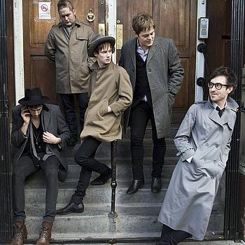

When thinking about the mise en scene (props/costumes/facial expersisions) in my photos, I looked at how the image and characters of bands similar such as The Libertines and The Paddingtons were created. The costumes used in both of these photos and the expressions on the bands faces, gives an impression of their personalities. In the shot of The Libertines, the background is plain which helps to focus on the individuals. Also they are all wearing leather, which instatly gives the impression that they are 'bad lads'. In the shot of The Paddingtons, they are all wearing long coats and looking away from the camera which gives me the impression that they are quite casual and busy. In both shots, the bands are wearing clothes that are very trendy in the Indie genre, and I think this is a key thing to think about when thinking about Mise en scene as it shows off the bands personality. After looking at both these shots, I took into conideration what impressions both bands were trying to give in. I took ideas from both of these shots when shooting my photos of my band.


In this shot, which I used for my contents page, I took an image of just the lead singer of my feature band. For this image, I took a side view of the singer, I did this to show his facial expresion which expresses his passion for the music. I have used the props of a guitar as it shows what type of band it is, and also shows the genre of the music (Indie/Alternative). I have shown the personality of my artist by putting spotlights in the direction of him, to show he is important and quite cocky, as he likes to be in the spotlight. His body language is showing he is very into the song he is playing and looks very emotional towards it.
Q3: What kind of media institution might distribute my media product and why?
After researching, i have found several media institutions that I feel would definatley be interesting in producing my music magazine. IPC media would be a very good one to produce my magazine as it is a very big company and produces such music magazines as NME and KERRANG.ds wear. NME is the magazine which relates to my music magazine the most, NME (new musical express) is an English music magazine which features 'Indie/Alternative' bands in it. It included both signed and unsigned acts and all 'top ten tracks' etc. The target audiene for NME is usually 16-20 as they buy it so find out the latest news/music for the Indie scene.hese bands are 'Indie/Alternative' and i took note of what they are wearing and how they are stood and tried to use this when thinking about ideal outfits. This is the typical band that would fit my 'rock and roll' stereotype. I also looked at the emotions on their faces and tried to use them in the shots of my bands.http://www.ipcmedia.com/ Link


The target audience is a very big thing to think about when talking about a medie piece. The target audience will determin the appearance of the magazine and the style of which it is wrote in. My target audience varies from 16-20 year olds and targetted at both males and females as they will both like this kind of genre of music. I feel both young women and men would be attracted to my magazine by the shots of my bands because, boys would see them as icons and also girls would be attracted to them so therefore the images would be looked at by both genders. I think my magazine would be suitable for any nationallity but mainly I think for British people as it is written in English and it is focused on the British much scene.
I definatley feel that I have targetted the right age group as from my research, I noticed that this age group are the most popular age that listen and are interested in this type of genre because most of the bands are around this age group themselves. Teenages are also the most popular people that buy magazines so I think it was a good idea to create a music magazine for them. When giving out my questionnaires to people on what they thought of my magazine, the responses i got all suggested that my target audience was for teenagers of both genders. This definatley implies that I have hit my target audience correctly and that my magazine will appeal to them and they will enjoy reading it.
Classic Rock (67,399)Q5-How did i attract/address my audience?
Kerrang! 76,937)
Metal Hammer (45,809)
Mixmag (35,817)
Mojo (106,218 )
NME (64,033)
Q (131,330)
Rock Sound (23,021)
Terrorizer no figures (14,952)
The Fly (103,051)
Uncut (91,028 )
Word (33,217)
These are the UK circulation figures for music magazines, as you can see thousands of people by music magazines and therefore this shows that they are a popular sub-culture. There is alot of different music magazines that are sold on the Uk market, As you can see, 56,284 people buy NME magazine which is a magazine deficated to my genre of music 'Indie/Alternative'. Also the magazine 'Q' gets bought by 131,330 people which means it is one of the leading music magazines bought in the UK.
Here are the Uk top ten albums of 2009 (From The Guardian)
1. The xx – xx
2. Fever Ray – Fever Ray
3. Wild Beasts - Two Dancers
4. Dirty Projectors – Bitte Orca
5. Animal Co llective - Merriweather Post Pavillion
6. Florence and the Machine – Lungs
7. Noah and the Whale - The First Days of Spring
8. Micachu and the Shapes – Jewellery
9. La Roux- La Roux
10. Yeah Yeah Yeahs- It's Blitz
From this List of Top ten albums, It shows that the 'Indie/Alternative' genre, is definatley a big genre in the Uk. Some of the Uk Top 10 Albums where Indie/Alternative' amoungst other genres, This shows my genre is a popular one.
Another way i can target a specific audience is by socio-economic status, which i refered to previously in my blog. It is basically where you can split up the public, depending on their job/occupation. There are 6 different groups which are:
A- Profesional/managerial workers
B-Intermediate managerial/ administrator
C1- Skilled workers, none manual
C2- Skilled, manual workers.
D- Semi-skilled workers
E- Unskilled workers, unemployed, pentioners
After looking into all of this potential groups that I would focus on, I have decided to try and reach all of them in time, but mainly C1-E will be my prefaired groups to target.
Q5-How did i attract/address my audience?
To attract my Target Audience to my magazine, I did a number of things. The firs thing that I feel attracts my audience to my magazine is The name (Indie-Pendant) this not only attracts the audience but addresses it because most people will know then, that my magazine is dedicated to the Indie Genre, as proven in my audience feedback.
The second thing I did to attract my audience is my use of mise-en -scene which means 'everything in the frame'. My pictures address my audience by the use of clothes they are wearing and their props such as guitars and microphones.
Another thing that helps attract my audience is the colour scheme i have used. I decided to use the same colour sheme through-out my magazine in order to keep it looking professional. I think that the colour scheme i have chosen, helps to attract my audience as I have used a vivid red and also black and white which are three distinctive colours. These colours will also address my audience of the genre of my music because these colours are typical colours used in my chosen genre, which has been shown in my questionnaires and audience feedback.
Q6- What have i learned about technology and the skills I have learned?
Before actually starting the production of my media product, I learnt how to use an internet site called blogger.com which is a site dedicated to blogging. Right from the start of my process, I have used blogger to post my ideas on planning/making of my product. I have discussed the genre/target audience of my product and added pictures/videos onto my blog to help me through the researching and planning process. I think blogger was an excellant tool that I found out how to use as it is an easy way of sharing your ideas and showing your planning/production process in an orderly way. Even though blogger was a great website to use, it sometimes created problems for me because if alot of people were on the website at once, it took a long time to upload pictures/videos to your blog.
During the actual creating of my media product, I used two softwares which are:

This softwear is called Photoshop and I used it to cut out images from my actual pictures to add them to a different background for a better effect or to cut the image down in size. I also used photoshop to add colour to my photos to enable them to stand out and also to make some of my images less pixilated, so the photos became better quality on my magazine. By using Photoshop to correct and improve my images, in the end it made my shots alot more professional and creative

This is the logo for a softwear called InDesign, which is a programme that I used to create the pages of my magazine. On this programme I designed the layout of my page which made it easy when deciding where I am going to put my text/images. I learnt to apply colour filters to create an interesting final image that fitted the ‘house-style’ of my magazine, also I found out how to change the colour of texts and background, amongst alot of other things. It was hard at first to use this programme as it is a quite detailed programme but once I got the hang of it, It was very beneficial and made my magazine pages look professional.


Another thing i learnt while the planning process of my product was a website called dafont.com which is a site where you can easily find and download fonts that I could possible use for my product and that are suitable for my genre. This was also a very good website that I learned how to use because I could browse through all the different fonts and choose one that represented my magazine perfectly, I found this sometimes time-consuming as there was over 100 pages of fonts.

This is the camera that I used to take all of my shots on, for my music magazine. I liked using this camera to take shots of my band as it is a very high quality camera and also had alot of different settings to capture my shots on. By using different lighting and locations, I could take very high quality shots on this camera that looked very professional. I used different angles and settings such as flash on/off and different colour settings to get a range of different shots for my magazine so it does not look boring. The only difficulty with using this camera is that the pictures came onto the computer very big, but they were still perfect quality when I resized them.


Another website I used during my project is YouTube, This is a site which enables uses to upload videos to the website to share with the rest of the people on this website. I think using how to upload videos from this website on to my blog was a very usefull tool, as i could watch videos of the bands that relate to my magazine and get ideas from their clothes etc. It is a very easy way to share ideas on my blog and on the website it is relatively easy to find what band you are looking for.
Q7-Looking back at your preliminary task, what do you feel you have learnt in the progression from the start to the full product?
After finishing this task of creating my own music magazine, I looked back at my prelimary task which was the first stage in my process and I compared the two of my front covers. Since I created my Prelimary task, I have learnt alot of new skils and techniques, including how to use Photoshop and Indesign properly and this has definatley affected my final product. In my prelimary task, I took a simple shot of my model infront of a background, I liked this shot that I took but I did not make it better by using InDesign or Photoshop like I did when creating my music magazine. Another thing I noticed about my prelimary task is that there wasn't a consistant house style of colours as there is with my music magazine, and It wasnt until after I had finished my music magazine that I realised this. In my prelimary task, I don't think my front cover stood out enough to readers, the colours were not used to there best ability and I dont think it was very inviting for poeple to pick up, as i have produced my music magazine, I have learnt more about colours and how to create a front page that stands out and makes people want to buy it. Another very important thing I have learned since my prelimary take is to include more exciting sub titles on my front page, to want more people to open it up and read on. I still think I did very well in my prelimary task but I feel that I have benefited alot from creating my music magazine and now feel I can use both Indesign and Photoshop to the best of my ability in order to make my front page look professional.
After finishing this task of creating my own music magazine, I looked back at my prelimary task which was the first stage in my process and I compared the two of my front covers. Since I created my Prelimary task, I have learnt alot of new skils and techniques, including how to use Photoshop and Indesign properly and this has definatley affected my final product. In my prelimary task, I took a simple shot of my model infront of a background, I liked this shot that I took but I did not make it better by using InDesign or Photoshop like I did when creating my music magazine. Another thing I noticed about my prelimary task is that there wasn't a consistant house style of colours as there is with my music magazine, and It wasnt until after I had finished my music magazine that I realised this. In my prelimary task, I don't think my front cover stood out enough to readers, the colours were not used to there best ability and I dont think it was very inviting for poeple to pick up, as i have produced my music magazine, I have learnt more about colours and how to create a front page that stands out and makes people want to buy it. Another very important thing I have learned since my prelimary take is to include more exciting sub titles on my front page, to want more people to open it up and read on. I still think I did very well in my prelimary task but I feel that I have benefited alot from creating my music magazine and now feel I can use both Indesign and Photoshop to the best of my ability in order to make my front page look professional.
Conclusion
Overall, after finishing my music magazine, I am very happy with how all my pages have turned out. I think that my front page definatley stands out to people by the colours used and my cover isn't overpowered by different colours. One thing I particulary like is the name of my magazine which is 'Indie-pendent' because I think it really sums up my music magazine and its genre and at the same time, is eye catching and not boring to people. I think all of the pages in my magazine look good and I like the layout on them all and also the colours used as I have kept a consistant house style to make it look more professional. I think the colours I choose (Red, black and white) where a very good choice as they represent the genre of music that my magazine features and I have managed to keep all of these colours consistant throughout all of my pages.
Overall, after finishing my music magazine, I am very happy with how all my pages have turned out. I think that my front page definatley stands out to people by the colours used and my cover isn't overpowered by different colours. One thing I particulary like is the name of my magazine which is 'Indie-pendent' because I think it really sums up my music magazine and its genre and at the same time, is eye catching and not boring to people. I think all of the pages in my magazine look good and I like the layout on them all and also the colours used as I have kept a consistant house style to make it look more professional. I think the colours I choose (Red, black and white) where a very good choice as they represent the genre of music that my magazine features and I have managed to keep all of these colours consistant throughout all of my pages.
No comments:
Post a Comment